Danish House Tour: Minimalism in Greve
I'm a fan of simplicity, straight lines and open spaces.
When I came upon this pin from my dashboard feed, I had to dig deeper.
I was in love with the look and fell of this Danish townhouse the moment I first laid eyes on it.
Husterapi, as this project’s called; it's everything I envision for my own home one day: bright white interiors lit up from the daylight of the natural world outside, while including only the essentials when it comes to the furnishings and decor; elements pulled from nature amongst the earthy color palette of pine, stone and white walls throughout the interior settings of this chic little abode.
Touring the interiors of this updated and renovated cottage bungalow style setting (shared by Danske BoligArkitekter, envisioned and executed by architect Morten Dalsgaard of m4 Architects) through a beautiful series of interior shots, it's impossible to overlook how each room of this inviting home is nicely fitted with an eye-drawing accent addition to compliment.
Let's take a look at these below.
An inviting open space setting upon first entering in to this Greve bungalow, with wicker style basket for housing a lovely indoor botanical, adding a touch of nature to balance out and harmonize this lovely open space.
A chic combination of wood countertops and ascending stairwell upon first glancing, with an expansive floor space of concrete rectangular floor tiles, help to introduce the mood and feel still to come from exploring the inner settings of the house.
Rounding the corner is more open space, as both the kitchen and dining area have no obstacle to border off or disconnect the two.
It's easy foot path access from the fridge to the table!
I'm in admiration especially of the contrast of black and wood seating accents against more of the white wall and stone tile floor interiors.
It really draws the eyes toward the furnishing additions, helping to make access to them easily identifiable and inviting to guests frequenting the setting.
All of these decor pieces really stand out!
And if you turn 180 degrees from the previous image, we see more open space, as there's direct access in to the living room and entertainment settings from the dining room area.
Do you see the addition of the "rules of the house", stenciled in stylish typography along the wall to the right?
It says:
In this house...we are real, we make mistakes, we say I’m sorry, we give second chances, we have fun, we give hugs, we forgive, we do really loud, we are patient, we love.
Words to live by!
I'm in love with the stacked cobblestone wall backsplash in this cornered living room, with complimenting couch and area rug to emphasize the stone gray elements.
And here again are the same two previous shots, side by side, showing the open connection between both ends of this shared space.
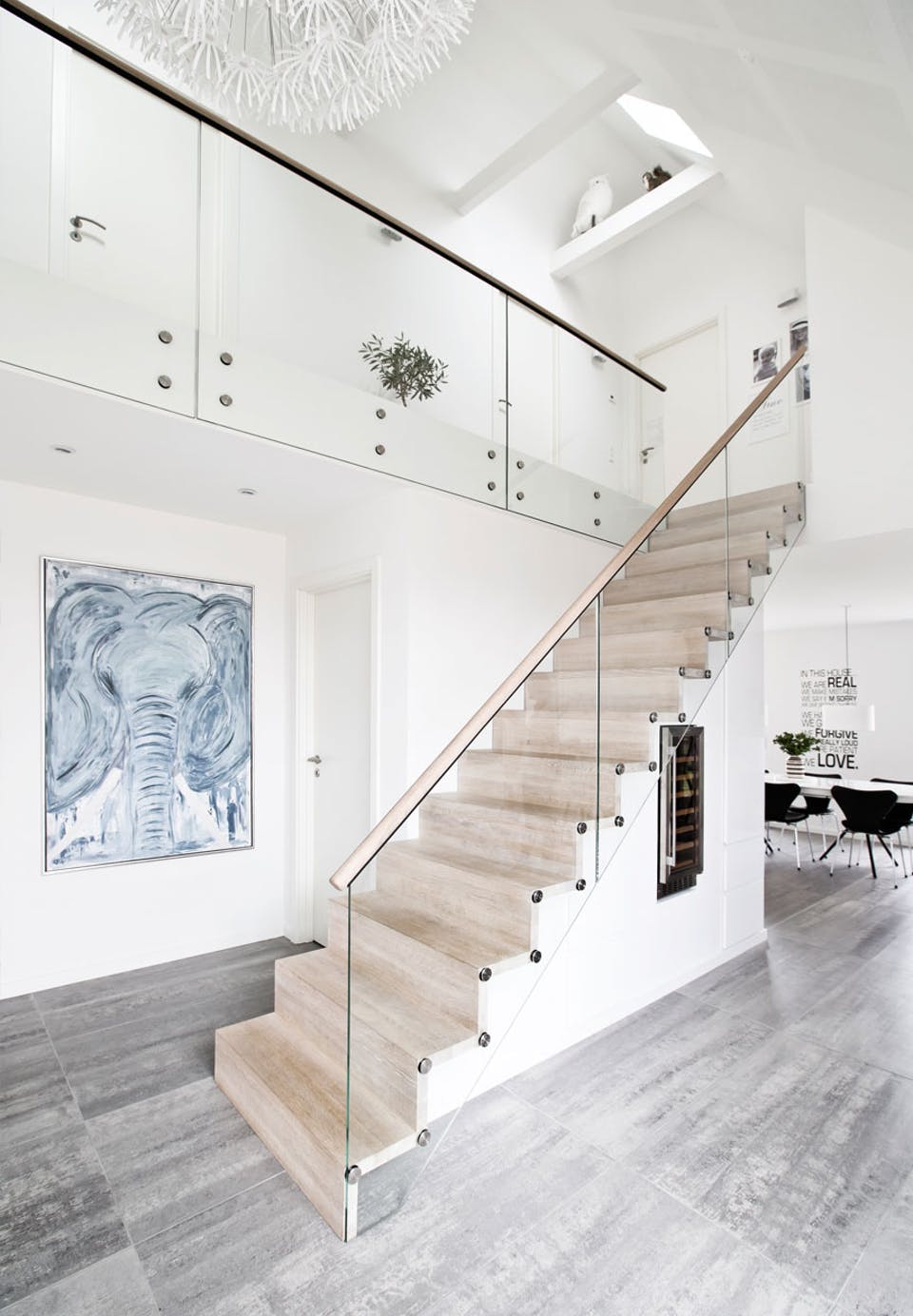
Returning to the front entryway of the house, an abstract elephant wall art hanging to greet us as we make our way up to the second floor.
If I had to take a guess, I’d say that the “elephant in the room” (no pun intended) was the design inspiration for this update look to the home.
Also, I'm really admiring the straight lines and angles all throughout the house!
From the upstairs balcony hallway, we have a direct line of sight to the open space settings of the first floor below, and already you can see where mindfulness came in to play when looking to add the wood elements, via the flooring, island table and stool seating chair additions to compliment the open space gathering of the front foyer.
The open skylight additions above really help to add to that natural world feel from within this home by letting a generous amount of daylight in!
And here again, the previous shot, with the additional image included, showing the view of the upper walkway from the opposite side.
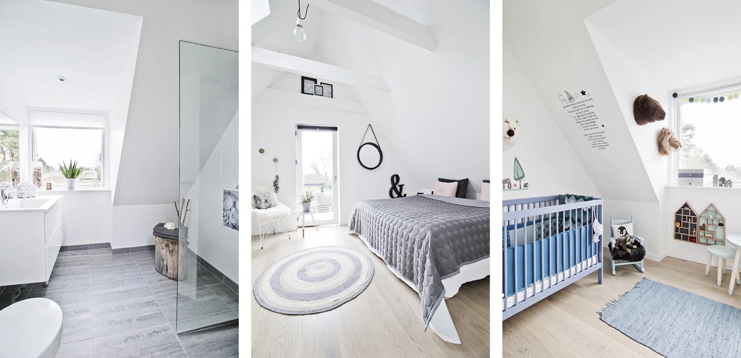
Here's a trio shot (from left to right) of the guest bathroom, master bedroom and child's nursery room.
I spy with my two eyes wild and cuddly animal critters throughout!
And again, the previous shot of the master bedroom, by itself.
Stop. Right. Here.
This bathroom!
I'm not sure which part of the look and layout is my favorite: the addition of bundled branches resting in the left corner, the little meditating iconography and cactus plant combo in recessed shelving over the commode toilet, or the wood log seating stool for accompanying a resting nook to the glass panel divider shower stall.
It's so hard to choose!
Can I have them all?
It's just an ideal meditation setting; an invitation for unwinding and reflecting in, in my opinion.
Making way outside to the backyard patio space, an ornate moose antler and pill shaped wicker basket tiki style lamp lighting fixture add a complimenting touch of the great outdoors to this brick fireplace gathering.
And again, more stacked cobblestone with this l-shaped patio seating arrangement and deck setting.
I do enjoy the adjacent vertical wood panels painted black, including the hard wood floor planks with angled arch ceiling slats and potted palms to help tie everything together and bring it all in!
And again, the second image of the outdoor lounge space settings.
Straight lines all around!
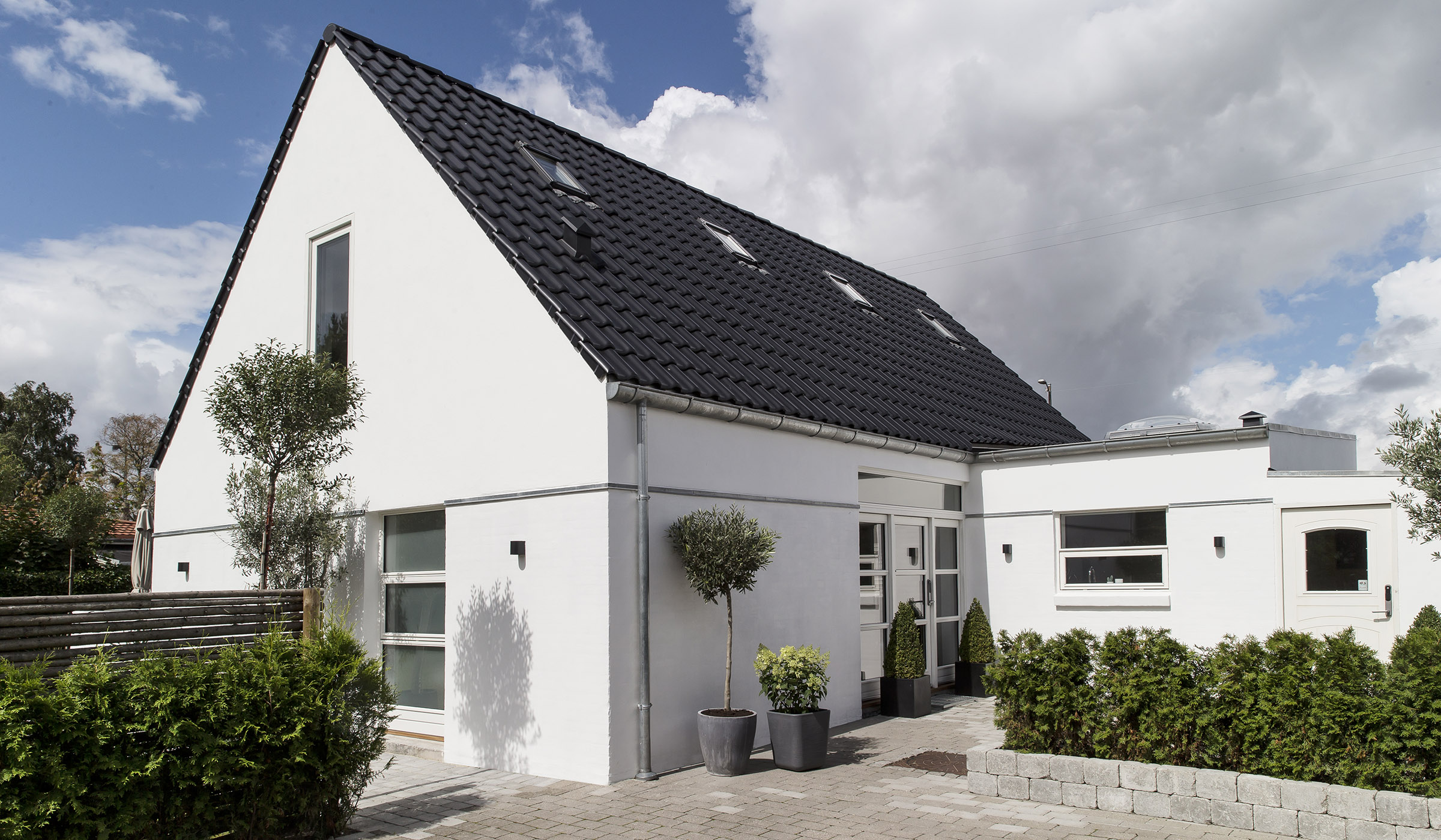
And a final shot of the home.
When can I move in? :)
Image + Content Credits: Christina Kayser Onsgaard + Christina B. Kjeldsen


